Flexbox and Grid:
Cascading Style Sheet is a style sheet language used to describe how a HTML document is displayed. CSS is a foundation technology of world wide web, along with HTML and Javascript. To simplify the creation and maintenance of webpages responsive layouts are developed in CSS. Now let us see about the Grid and Flexbox layouts in CSS.
What is CSS Flexbox?
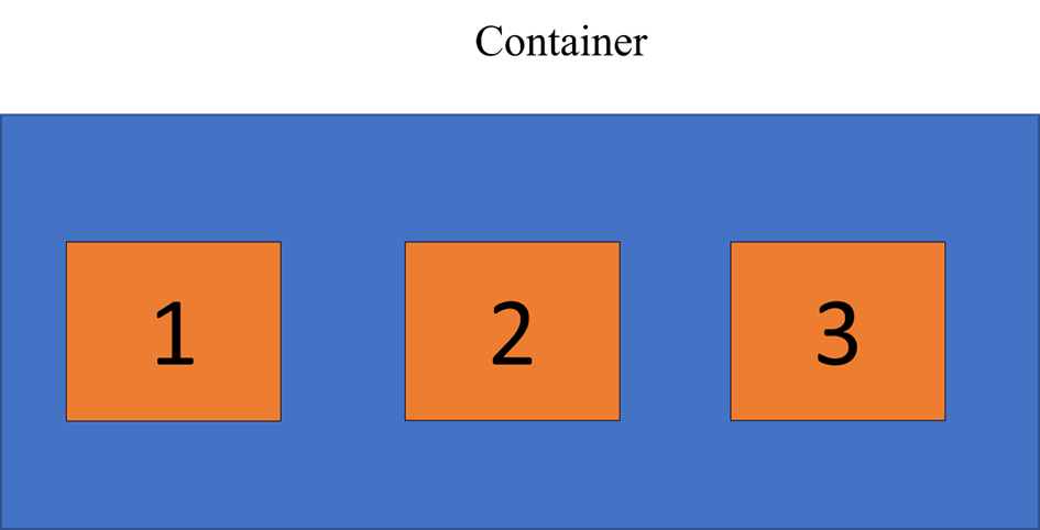
CSS Flexbox is a one-dimensional layout model that makes it easy and flexible in designing effective layouts. This model helps in allocating and aligning space among items. Flex items are positioned inside a flex container along a flex line. By default there is only one flex line per container.
Basic concepts of Flexbox:
Two axes of Flexbox:
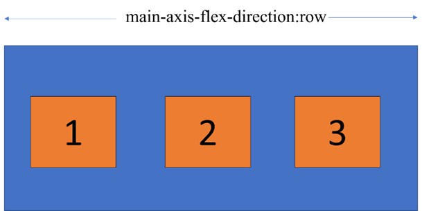
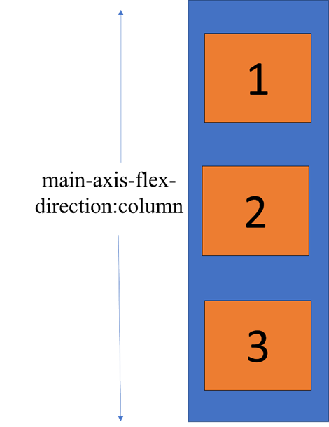
main axis: The main axis is the primary axis along which the flex items are aligned. It is defined by flex-direction, which has 4 values:
- row
- row-reverse
- column
- column-reverse
In row or row-reverse our main axis will run along the row in the inline direction.
In column or column-reverse our main-axis will run from top of the page to bottom along the block direction.
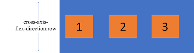
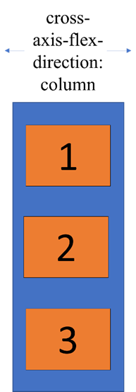
Cross-axis:
The cross-axis runs perpendicular to the main axis, therefore if our flex-direction is set to row or row-reverse the cross-axis runs down the column.
If flex-direction is set to column or column-reverse, the cross-axis runs across the row.
main-start and main-end:
The flex items are placed in the container with items beginning with main-start and ending with main-end.
CSS Flexbox Properties:
| Property | Description |
| flex-direction | Defines in which direction a container wants to stack the flex items. |
| flex-wrap | Specifies whether flex items should wrap or not. |
| flex-flow | Shorthand for setting both flex-direction and flex-wrap |
| justify-content | Used to align the flex items with values center, start, end, space-around, space-between. |
| align-items | Vertically align the flex items along the cross axis. |
| align-self | Used on flex items. It overrides the container’s align-items property. |
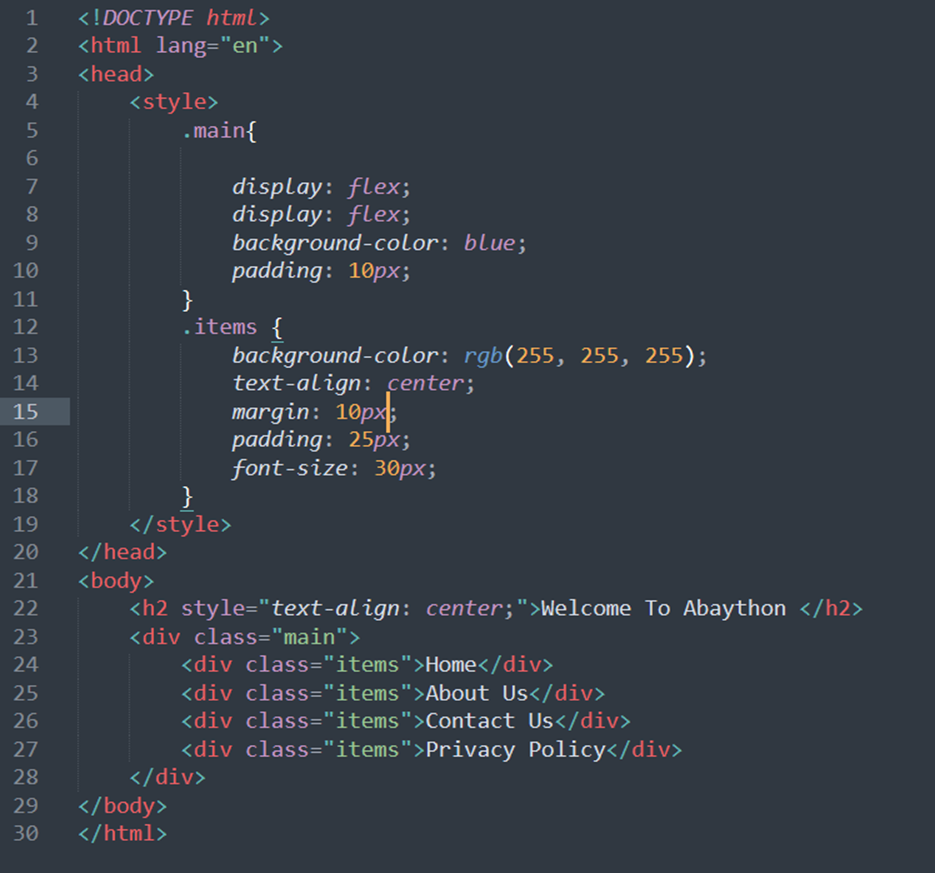
Example of flexbox:
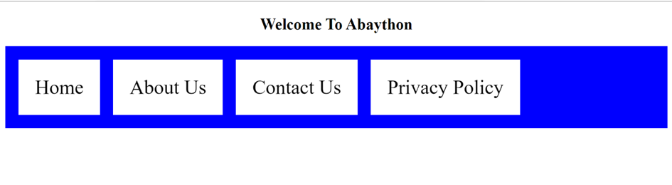
OUTPUT:
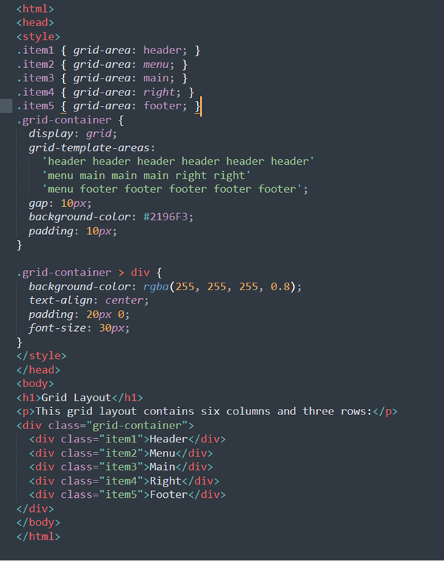
What is Grid Layout?
CSS Grid Layout is a 2D grid-based layout with rows and columns, useful in creating more complex and organized layouts without using floats and positioning. To define a Grid container, you will have to pass a display:grid property to your element
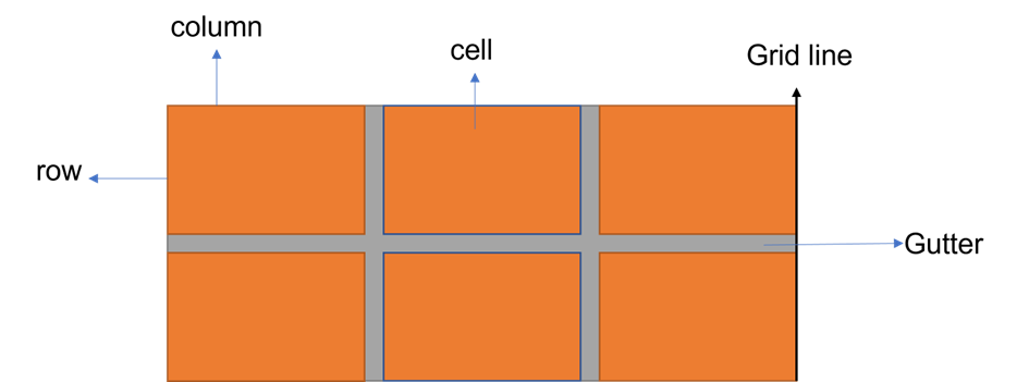
Important terms:
- row
- column
- cell
- grid line
- gutter
Grid Container:
A grid container is an element on which the display: property is applied. It is the direct parent of all the grid items. The items of the grid are placed inside rows and columns.
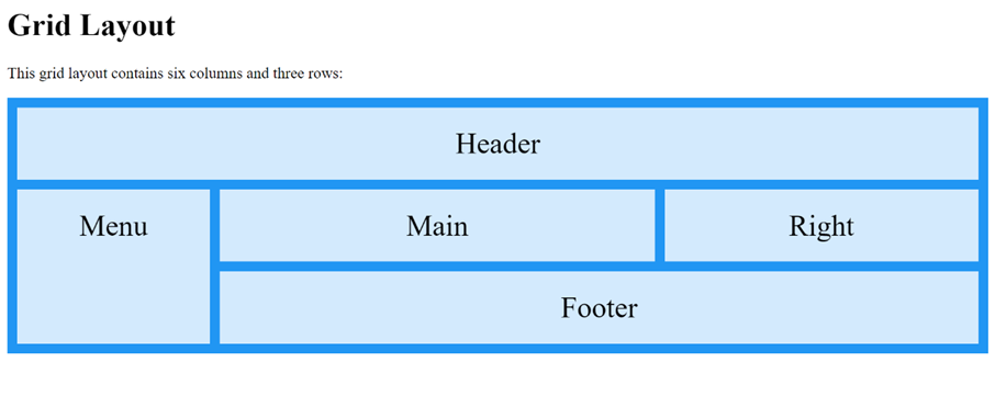
OUTPUT:
CSS Grid Properties:
| Property | Description |
| column-gap | Specifies the gap between the columns |
| gap | A shorthand property for the row-gap and the column-gap properties |
| grid | A shorthand property for the grid-template-rows, grid-template-columns, grid-template-areas, grid-auto-rows, grid-auto-columns, and the grid-auto-flow properties |
| Grid-area | Either specifies a name for the grid item, or this property is a shorthand property for the grid-row-start, grid-column-start, grid-row-end, and grid-column-end properties |
| Grid-auto-columns | Specifies a default column size |
| Grid-auto-flow | Specifies how auto-placed items are inserted in the grid |
| grid-auto-rows | Specifies a default row size |
| grid-column | A shorthand property for the grid-column-start and the grid-column-end properties |
| grid-column-end | Specifies where to end the grid item |
| grid-column-gap | Specifies the size of the gap between columns |
| grid-column-start | Specifies where to start the grid item |
| grid-gap | A shorthand property for the grid-row-gap and grid-column-gap properties |
| grid-row | A shorthand property for the grid-row-start and the grid-row-end properties |
| grid-row-end | Specifies where to end the grid item |
| grid-row-gap | Specifies the size of the gap between rows |
| grid-row-start | Specifies where to start the grid item |
| grid-template | A shorthand property for the grid-template-rows, grid-template-columns and grid-areas properties |
| grid-template-areas | Specifies how to display columns and rows, using named grid items |
| grid-template-columns | Specifies the size of the columns, and how many columns in a grid layout |
| grid-template-rows | Specifies the size of the rows in a grid layout |
| row-gap | Specifies the gap between the grid rows |