Data Visualization
Data Visualization is a fundamental step involved in the activities of a data scientist. It is a process of projecting complex information in a visual form or context to give more understanding and insights.
It communicates the relationships of the data with images. This is important because it allows trends and patterns to be more easily seen.
It helps turn complex numbers into a story that people can easily understand.
Primary uses include
- Explore data
- Communicate data
In this article let’s explore the matplotlib library in python.
matplotlib:
A wide variety of tools exist for visualizing data like matplotlib, pandas visualization, seaborn, ggplot, plotly.
Today we will explore matplotlib
It is the most widely used package for 2D graphics. It is low level and provides lot of freedom.
As matplotlib is not part of the core python library first we need to install it using the command
python -m pip install matplotlib
We will be using matplotlib.pyplot module.
How to plot a line chart using matplotlib?
Line chart is useful in tracking changes over short and long periods of time. When smaller changes exist, line charts are better to understand. It is also useful in comparing changes over same period of time for more than one group.
Syntax:
import matplotlib.pyplot as plt
plt.plot(x_values,y_values)
Here x_values means values to plot on the x-axis and y_values means values to plot on the y-axis.
Example:
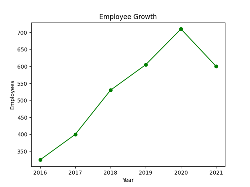
Now let us see the number of employees in Company A for the last five years.
import matplotlib.pyplot as plt

# number of employees

emp_count = [325, 400, 530, 605, 710, 600]

year = [2016, 2017, 2018, 2019, 2020, 2021]

# plot a line chart

plt.plot(year, emp_count,'o-g')

#set axis titles

plt.xlabel("Year")

plt.ylabel("Employees")

#set chart title

plt.title("Employee Growth")

plt.show()
Output:

How to chart multiple lines in a single chart?
Now let us consider two companies A and B and its employee growth for the same time period.
import matplotlib.pyplot as plt

# number of employees

emp_count_A = [325, 400, 530, 605, 710, 600]

emp_count_B = [225, 310, 360, 300, 450, 560]

year = [2016, 2017, 2018, 2019, 2020, 2021]

# plot a line chart

plt.plot(year, emp_count_A,'o-b')

plt.plot(year, emp_count_B,'o-r')

#set axis titles

plt.xlabel("Year")

plt.ylabel("Employees")

#set chart title

plt.title("Employee Growth")

#legend

plt.legend(['A', 'B'])

plt.show()
Output:

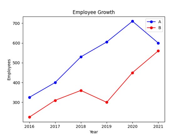
In this above example both lines share the same axis. So to distinguish them we have used legends.
In the above two examples in addition to the values for x and y axis we have third argument ‘o-g’ which means format string. These are abbreviation for quickly setting line properties.
A format string consists of three parts ‘[marker][line][color]’ with each of them being optional.
To know about bokeh library click here!